

If at First You Don’t Succeed: The Development Team Behind the Redesigned Mercari Home Screen


At the end of March 2020, the Mercari marketplace app launched a redesigned home screen (the Android version of the app had a full redesign at the end of June). Before this redesign, there were more than 10 tabs, split into categories such as Fashion and Sports. This was simplified into 4 tabs, creating an easier experience for our users to use the app the way that best suits them.
Sounds simple, right? Wrong!
This redesign project was actually in the works within Mercari’s product development team for over a year before its release. And it may be hard to believe, but their first attempt at a release was actually a failure, and ended up lowering the rate of visits to the home screen…
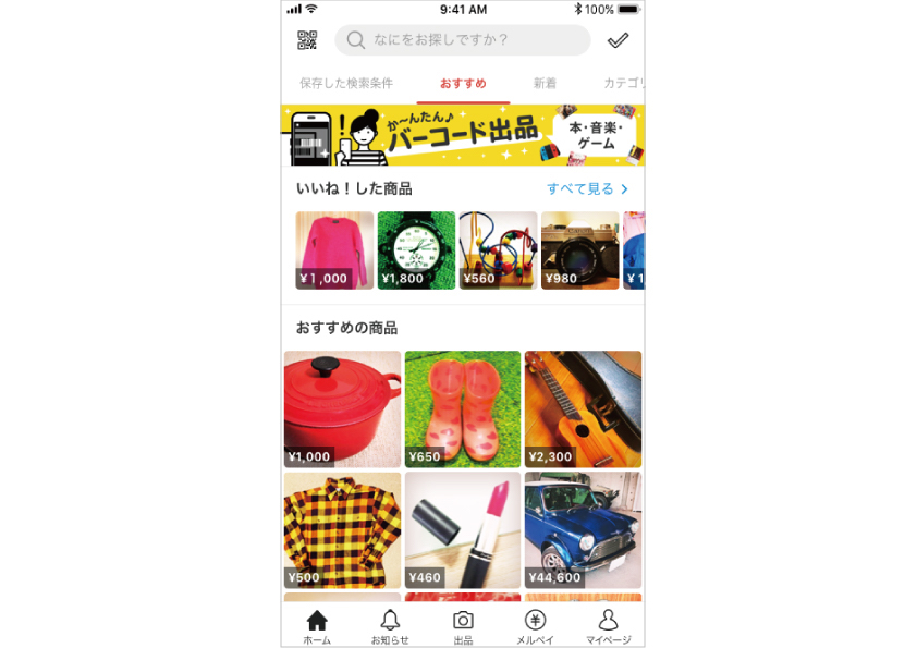 The current Mercari home screen, after the redesign
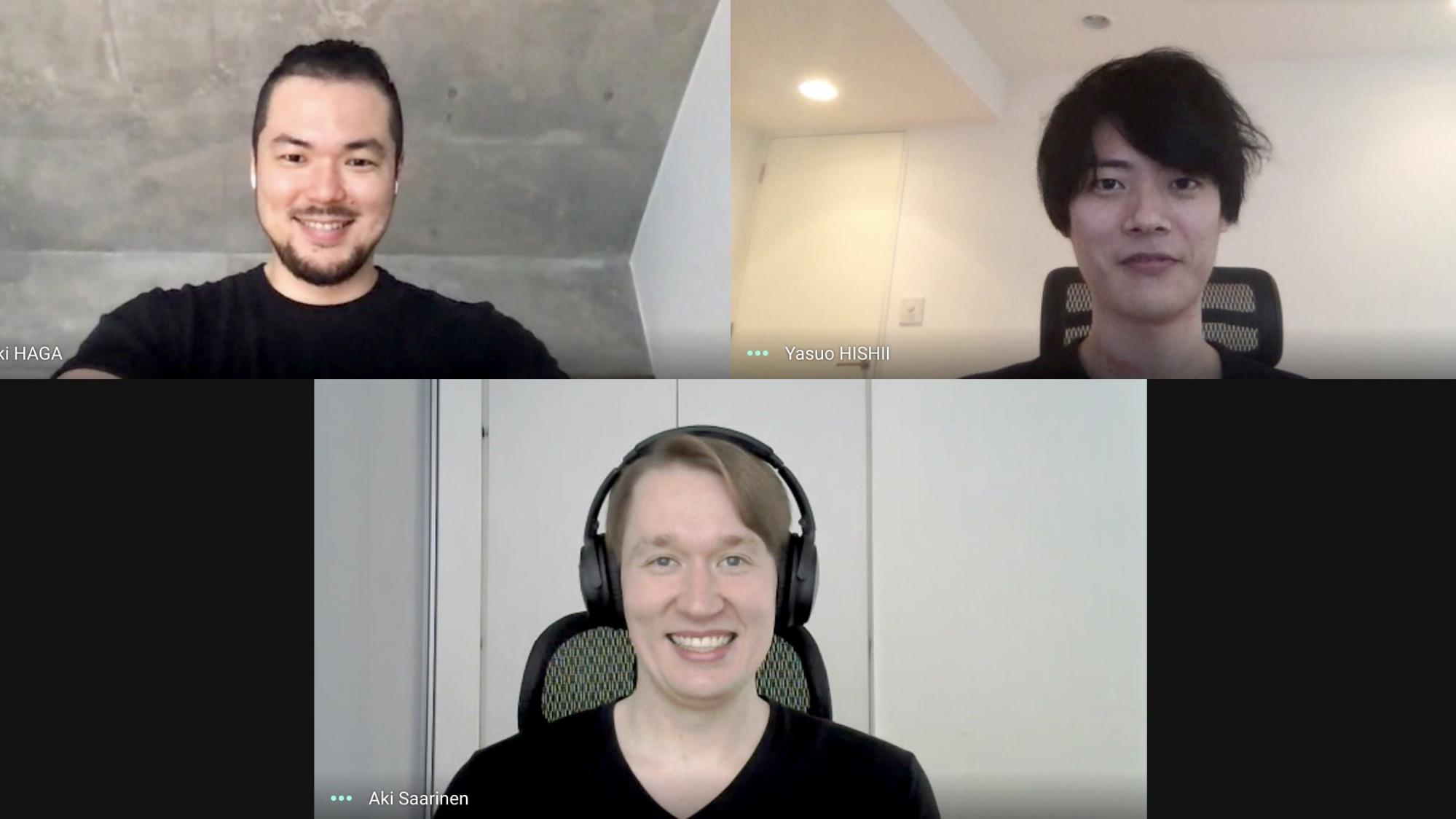
In this Mercan article, we interview three members of the home screen redesign project: project owner (PO) Yasuo Hishii, technical product manager (TPM) Aki Saarinen, and iOS engineer Masaki Haga. Today’s interviewer is Yuki Yoda, manager in the Product Division.
Profiles
-

Yasuo HishiiAs a new graduate, he joined Fujitsu, where he started his career as an infrastructure engineer. After that, he worked as an application engineer and PM at an IT startup, before joining Mercari in July 2018. Currently promotes feature development and analysis as a PM. -

Aki SaarinenDiscovered programming at the age of 8, and has aspired to create amazing products ever since. After working at a number of startups, joined Mercari in October 2019. Currently leads personalization-related development as PM. -

Masaki HagaJoined Mercari in April 2018, and has since been involved in UX-related projects for Mercari UK and Mercari JP (image search, home screen, etc.). Currently the iOS tech lead in the Personalization Team. -

Yuki YodaAfter working at an IT startup affiliated with a major printing company, joined GREE, Inc. in 2011. In 2015, joined Fast Retailing Co., Ltd., where he handled development of the Uniqlo app and the GU online store as PM. In February 2018, joined Mercari, Inc., and worked as PM for Mercari US. He has worked as a manager in the Product Division of Mercari JP since July 2019.
Taking “go bold” a little too far: The reason the first redesign failed
Yoda: Redesigning the home screen was something discussed within the company for a long time. Hishii, you were in charge of the project from the very beginning. What was the reason for the redesign?
Hishii: The home screen is the face of an app, so to speak. It’s a very important part that’s seen by many users. But we don’t have the resources to do everything, so improvements to the home screen kept getting put on the back burner. When we finally got around to it, we looked at the stats again, and less than 10% of users were actually using the home screen. We even heard comments from users saying that the home screen was too cluttered, or that they always searched for what they wanted, so they didn’t bother looking at it. In short, even though the home screen is something seen by all users, it wasn’t usable with any sort of purpose in mind.
 The Mercari home screen before the redesign
Haga: On the development side, the home screen was using old code that had been around since the early days of Mercari. We were working on rearchitecture of the service as a whole, but we hadn’t gotten around to the home screen yet. So the development side’s goal was to use this redesign as an opportunity to create a new architecture for the screen and get it into a state where various components can be added later.
Yoda: Sounds like redesigning the home screen was essential for both the service and the developers. When did the actual work on it begin?
Hishii: Around February 2019. We spent approximately six months on the first redesign. But unfortunately, it went really badly.
 Yasuo Hishii (PO)
Yoda: What went wrong?
Hishii: The previous home screen was divided into more than 10 tabs, like Fashion, Sports, and Handmade. In the first redesign, we merged all the tabs into one, and changed the design completely. But as a result, the visit rate plunged.
Yoda: Yikes…
Hishii: Yeah… That meant it was failing to play its role as the face of the app. On top of that, we took “go bold” a little too far and changed the screen so drastically that we couldn’t figure out what the problem was. We couldn’t narrow down the cause, and we had no way of developing any hypotheses. We spent three months trying out a number of different things, but we couldn’t shake the feeling that the project wasn’t getting anywhere.
 The Mercari home screen after the first redesign
Haga: It felt like we were at a standstill. We were able to create a new architecture, but there was nothing to measure how useful it was.
The importance of taking small steps
Yoda: The project started back up again after that, right?
Hishii: That’s right. We started the project back up again around January 2020. That was when Mercari decided to focus on personalization, with the goal of creating unique service experiences tailored to each user, and a team structure specializing in that was formed. Within that, it was decided that we would move ahead with the redesign of the home screen, and Aki joined us as a new TPM.
Yoda: Aki, you joined Mercari in October 2019. What did you think when you first saw the home screen?
Aki: In my previous job, I worked on UX redesigns and development of services using machine learning. So when I saw the state of the Mercari home screen project, my first thought was that everything they were trying to complete was way too difficult. (laughs)
 Aki Saarinen (TPM)
Hishii: (laughs) While talking to Aki, I realized that one of the biggest reasons we failed the first time was that we didn’t pay enough attention to the fact that many different kinds of people use Mercari, and they all use the app in different ways. Of course, it’s not like we were ignoring the voices of our users. But we focused too strongly on what we, the creators of the app, wanted, and so we changed too much at once. We should have narrowed it down to the points that needed to be changed the most, and focused on those first. We tried to jump straight to the top of the stairs when we should have just climbed the steps one at a time.
Aki: Mercari is used by a wide variety of people. It’s very difficult to boost the service experience for all users at once. So in order to narrow down the points that need to be changed the most, like Hishii said, you need to take the time to test things and see what kind of content you can provide to users and what the reactions are.
Hishii: Right. So after talking with Aki, we decided to start an experimental strategy, where we would only change the inner workings of the home screen, not the actual appearance, and see how users reacted. We ran many small tests to see just how much users would adapt to without significantly altering usability, and to determine where the users’ needs were highest. Because we took these small steps, we were able to identify what points to focus on in the redesign. Then, we were able to step on the gas and move ahead with development.
Yoda: How many tests did you run?
 Yuki Yoda (Manager, Product Division)
Hishii: We ran tests of four versions in three months. For the UI, we tested more than 10 changes.
An integral part of the home screen redesign: Scrum development
Yoda: Four versions in three months? That’s the kind of speed you can only get if development is going really smoothly, isn’t it? I know that Mercari is reaching a rather large size as a development organization. We’ve started to see problems like not enough communication between teams and work feeling siloed. How did you solve these problems?
Hishii: We did feel like we were running into issues like that. That’s why we’ve started using Scrum for development in some teams at Mercari, including the home screen redesign project. The good thing about Scrum is that you can decide how much you’re going to do in a certain period of time, then work towards that with everyone contributing ideas. Each project member was able to find the development rhythm that worked for them, while also checking in on everyone’s status and progress regularly.
Aki: The development speed was good, but it also helped that we were able to have a shared mindset among project members. There was very active communication, so even what Hishii and I had been talking about was able to be shared by everyone.
Yoda: How was it as an engineer?
Haga: It went very smoothly. We had completed the new home screen architecture and made it modular when working on the previous redesign. Thanks to that, we were able to work on both development of the new overall framework for the UI and inserting the new home screen at the same time.
 Masaki Haga (iOS Engineer)
Yoda: Sounds like you were able to make use of the previous development.
Haga: That’s right. In the new home screen redesign, each component is a view controller. The parent view controller and components are designed to be separate from each other, so we’re now able to create various components easily. Because of that, we can handle requests for new components from PMs of other teams without much difficulty. I think that now everyone has more freedom in their work, and we’re able to test new creatives and prototypes while also improving our technical debt.
Yoda: Scrum is a development framework that encourages active communication. The home screen project was running many small tests at once, which required a lot of communication. In that sense, it sounds like the perfect framework for the team.
Hishii: It is. When we first decided we were going to use Scrum, we all talked it over and agreed that we needed to be careful to not lose our agility. The team was very open-minded, with members voicing and testing out ideas regardless of roles and positions. For example, Haga would post on Slack saying “this feels better to me,” and it would spawn a big discussion. That kind of thing happened quite often.

Aki: The good thing about Scrum is that you can focus on your work while calculating backwards from your goals. Within that, if you have new ideas, you can flexibly incorporate them in. Also, like Hishii said, the teamwork in the home screen development team was amazing! I saw a number of cases where one person on the team was stuck on something, and everyone worked together to help solve the problem.
A home screen that highlights the relationship users have with the Mercari service
Yoda: Just because the redesign has launched doesn’t mean it’s over. What are you going to do in the next phase?
Hishii: I want the Mercari service to act as a partner to our users. To do so, I want to keep working on the home screen so it becomes more personalized to each user the more they use the service, and makes our users feel like they’ve really built a relationship with it. Mercari is no longer just about buying and selling items you don’t need; you can also pay for things using Merpay. I want to maintain that balance while also taking in new things.
Aki: I agree! There are still a lot of things we need to do in order to become a meaningful app for our users. We’re thinking about incorporating machine learning to create a personalized service experience for each and every user in the future. For example, we could display the most suitable recommendations, suggestions, and even UX based on user behavior. We’re already starting some trial and error to work towards that.
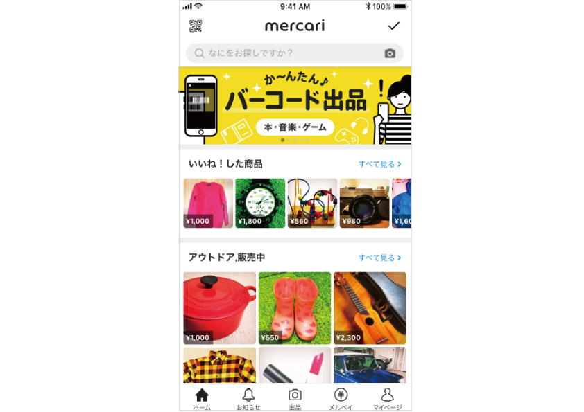
The current Mercari home screen
Haga: On the development side, we’ve already built the architecture, so we should be able to handle anything. Well, maybe not anything, but close to it. If we’re just replacing the data, we can release the changes without any development at all, and it would take only one sprint of development to add a new component. However, we can only manage a limited number of components at once. If the number of components is going to increase in the future, running manual tests for all of them will be difficult. One challenge we face is how to automate that process.
Aki: There are countless challenges with personalization, too. Some of our users use Mercari daily, but some only use the app once in a while. We need to look into and enhance the user experience for every single use case. Going forward, I want to involve more teams and people and combine everyone’s expertise to figure out what we need and what effects it will have.
Haga: Involving other people is really important. In development, it can be easy to get too caught up in your own work and lose interest in anything outside of your field of expertise, but I don’t want that to happen. I think it’s important to be interested in what other members are doing, and think about what kind of UX you might be able to create using that and what you would need. I want us all to work together to make up for what each of us may be lacking, and use that combined strength to create a better product for our users. To do that, I want this to be a team where even when we fail, we just get right back up again and try something new.
Hishii: Testing out hypotheses and failing helps us learn. I think it’s something to be praised, not criticized. In order to make the most of failure, you need to run many kinds of tests at high speeds, and the team needs to have a positive mindset. In that sense, this team already communicates well. We see the results, verify them, then move on to the next idea. I’d like to maintain the current atmosphere while growing the team in the future.
 Quick Reads ✨

